Creating focal points that make a big impact.
In design, every room needs a focal point or a focal wall. A focal point is the area your eye travels to first and has the greatest visual impact in the room. This home is a perfect example of how to maximize your focal points for a dramatic effect.
Ron and Kris are downsizing and before they move into this new home they wanted to give it a fresh new contemporary look. Here’s what we did:
Dining Room ~ Before
The dining room originally painted a deep red, which in its day was beautiful, now made the room feel dark and heavy.

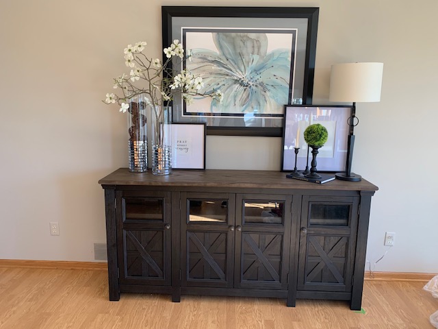
This 16 foot focal wall needed some larger pieces to fit the long dimension.

Dining Room ~After

First we painted the walls a lighter ‘Greige’ meaning it can look grey or beige depending on the light.This alone made a dramatic difference in opening up the space.
Then we went shopping for some larger pieces that would fill up this long wall. Kris fell in love with this credenza the moment she saw it and it was just the right fit. The next great find was the large framed art work that essentially set up our color palette for the whole house. Ron helped out pick this one out which we know as wives is so nice not to have to guess whether their hubby will like it…yay for Ron!

The lamp and florals had to be tall and substantial in size in order to not get lost on the 7 foot credenza. I chose the apple blossom stems to give it a light and airy feel and the clear glass vases to contrast the heavier dark cabinet.
Living Room ~ Before
The natural focal point in the living is the fireplace. Here the fireplace had a dated tile surround that didn’t really capture your eye.

Living Room ~ After

By changing out the tile with this gorgeous stack stone, the fireplace became the beauty it was meant to be. We carried the stone up to a new dark grey mantle to make it a true focal point. We painted the space above the fireplace to help it stand apart even more.
Ron and Kris wanted to have their TV (still coming) to be more at eye level so they found an unfinished TV console and stained it to match the mantle. (good job Kris:) Above it I chose three grey frames on hooks and asked Ron and Kris to find pictures of something special to them. Because their faith is the foundation of their lives they chose to put in images of Ron’s childhood home church, Kris’ childhood home church and in the center is a picture of their current church home.
How well designed are the focal points in your home?
Do they need update to a contemporary style?
The thing about creating a focal wall is that it doesn’t have to be challenging…in fact it’s what I love to do most as a designer!
Please contact me if you have any questions or would like some design help with your focal points!

